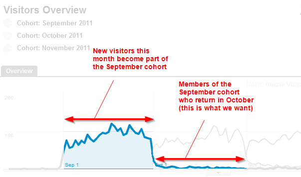
That’s some bad retention. Perhaps those animated GIFs aren’t as cool as you thought. Published March 31, 2012 at 603 × 356 in How to do Cohort Analysis in Google Analytics A cohort study can show how many new visitors in September returned in October Share this: Email a link to a friend (Opens in new window) Email Share on X (Opens in new window) X Share on Facebook (Opens in new window) Facebook More Share on LinkedIn (Opens in new window) LinkedIn Share on Tumblr (Opens in new window) Tumblr Share on Reddit (Opens in new window) Reddit Share on Pinterest (Opens in new window) Pinterest Like Loading...

